
Mobile Friendly Website Design
Is your website responsive? If not, you could be losing valuable business.

The mobile way is the only way
Chances are you are reading this on a mobile device.
Despite the tremendous growth in mobile devices, many designers and developers are still designing for desktop computers or big screens on their desks, rather than for the tablet or phone you may be holding in your hand.
Mobile Friendly design ensures your website delivers the best experience for mobile users as well as desktop, regardless of the screen size.

What is mobile-first design?
Mobile-first design is a design strategy that says when you create a website or app, you start by designing and prototyping the smallest screen first and work your way up to larger screens. In essence, it’s about delivering the right user experience to the right device.

Content First
Content becomes the priority in Mobile-first design. This design creates a hierarchy of content users need, use and appreciate. Designing with restrictions and limitations forces the user experience designer to remove unnecessary elements and focus on the essential.
Other services
E-Commerce Website Development
Learn more
Hosting Your website
Learn more
Content Management Systems (CMS)
Learn more
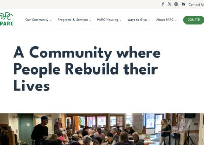
Mobile Responsive Websites


Resources
How Much Should Web Design Cost – Updated for 2023
How Much Should Web Design Cost?Custom Web Design vs Pre-made Web Design Depending on who you ask to design and develop a website, the price range...
How long does it take to build a new website and 9 other frequently asked questions we get about website development
Your most frequently asked website questions, answered! Digital Giants has been around since 2012 and during that time we’ve built a lot of...
